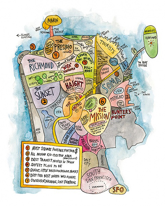
Tenderblog thinks so:
First off, where are the black neighborhoods? The Loin has been rather ignored. Fillmore is just part of Lower Pacific Heights. Western Addition is non-existent. Then there’s Hunter’s Point which has no “clever” tongue in cheek comment to it and is just colored black in what I assume is some allusion to there being blacks that live there… I realize that 7×7′s audience (if there actually is one) is just poshy, clueless ass clowns, but still, this is pretty blatant and is more than just an oversight, but more reflection of the artist and the magazine’s views of this supposed rainbow city.
Hmm. Also odd is that the Marina District isn’t on the map, which seems to be where a lot of the magazine’s readers would reside.
I believe it would be more accurately called stuck up, provincial, self-centered, and willfully clueless, rather than actively racist. You’ll note that Marin and Berkeley, both oversupplied with rich white people, also get short shrift. Like Hunter’s Point, many of the other outlying/relatively non-wealthy areas are also gray, not black.
So I’d say it’s more indicative of privileged people reinforcing their sense of privilege, rather than anything specifically racist, although the correlation between whiteness and wealth makes it impossible to separate the two. And to be fair, maps pretending that place X is at the center of the world are universal (e.g., China’s “Middle Kingdom” notions, so it’s also just people being people.
Thank you for posting this. I contacted the artist, who has not gotten back to me, about writing an apology in the next 7×7 for many of these. I also noted to her that the “fake” ships she points out which is an obvious jab at the tall ships at Hyde St. Pier and the hard working sightseeing/ fishing boats of Fisherman’s wharf, are not fake at all. They are all seaworthy and are sailed by the working class who’s homes are left out of her “map” which are in the poorer areas of SF.
My guess is that the map neglects certain neighborhoods because they simply don’t belong in the piece, since the point of the map is to highlight places where people enjoy spending time.
Sure, some folks like the Tenderloin or Bayview … but not many. When’s the last time you dropped by the Oakdale Housing Project to take in the sights?
That having been said, it really is shocking to see all of Hunter’s Point depicted as one giant featureless blob. It’s a huge piece of land, but it’s treated like a leper. And I don’t think that this one artist is the only person in the city to regard it as such.
Thank you for posting this! When I first saw the drawing for 7×7 I really didn’t understand how it made the cover– it’s not a very good illustration, it’s not graphically striking or at all interesting.
It’s just lame and it’s obvious the “artist” knows someone at the mag.
The Marina’s absence proves that the artist is racist against white people, too, I guess. And since the coastal fog and the industrial section are both the same color as Hunter’s Point, I suppose she’s saying black people are foggy and industrial. Or fog is black and industrial. Or industry is black and foggy. She’s clearly not only racist but also anti-industry and bigoted against fog. And the lack of any clever tongue in cheek comment about neighborhoods like Hayes Valley obviously shows her deep animosity toward boutique stores.
hahahaha
too bad 7×7 didn’t see this map, i http://www.parklifestore.com/Merchant2/merchant.mvc?Screen=PROD&Store_Code=PLS&Product_Code=ORKPRINT&Category_Code=PRINTS
There’s nothing for The Richmond, Twin Peaks or Lake Merced either.
It’s a slapdash sketch trying to emphasize some point or another. Lame not racist.