7×7 Can Do No Right When it Comes to Maps

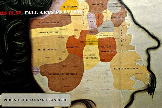
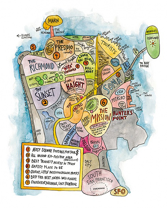
Phrenology Map 7x7 Magazine, San Francisco

A post at the San Francisco Citizen blog finds no credit for the above map in the print version of 7×7’s current magazine – and suspects it might have something to do with the fracas over this thing.

Indeed, I couldn’t find a version of the map on 7×7’s website, which is odd. But I’m gonna give them a pass because this new map is pretty cool on a couple of fronts.

First, it’s bizarre enough to be interesting – the descriptions applied to the various parts of town are an exercise in willful non-sequiter.

But best of all is its use of actual phrenological terms (philoprogenitiveness? C’mon!), and the probable inadvertent nod to our new favorite historical eccentric, Frederick Coombs, a.k.a., George Washington the Second.

Even before he went Cocoa for coo-coo puffs, Coombs wrote and self-published a book on phrenology called Popular Phrenology: Exhibiting the Exact Phrenological Admeasurements of Above Fifty Distinguished and Extraordinary Personages, of Both Sexes with Skulls of the Various Nations of the World. You can’t do much better than that in the “pseudoscience as prelude to insanity” department.
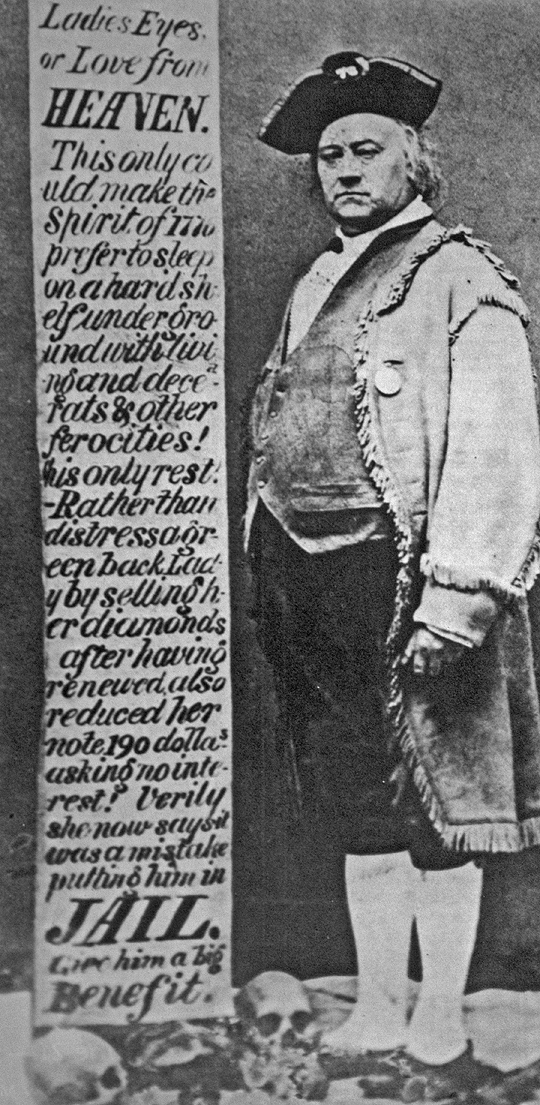
Washington the Second with skulls, San Francisco
Note the skulls. Awesome.

So, hats off to 7×7. (They do lose points, however, for the offensive profile of the goateed hippie that defines the edge of the map.)
Is This Map of San Francisco Racist?

Racist Map of San Francisco?

Tenderblog thinks so:

First off, where are the black neighborhoods? The Loin has been rather ignored. Fillmore is just part of Lower Pacific Heights. Western Addition is non-existent. Then there’s Hunter’s Point which has no “clever” tongue in cheek comment to it and is just colored black in what I assume is some allusion to there being blacks that live there… I realize that 7×7′s audience (if there actually is one) is just poshy, clueless ass clowns, but still, this is pretty blatant and is more than just an oversight, but more reflection of the artist and the magazine’s views of this supposed rainbow city.

Hmm. Also odd is that the Marina District isn’t on the map, which seems to be where a lot of the magazine’s readers would reside.

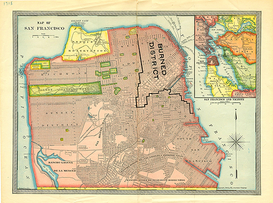
Nice Color Scan of San Francisco Map circa 1907 Showing Fire Line and Cemeteries

1905 Map of San Francisco

This map (courtesy, Prelinger Library) is a good way to visualize how much of the city burned after the earthquake/fire of 1906. It of course led to the building of refugee camps around the city, including in Mission (now “Dolores”) Park.

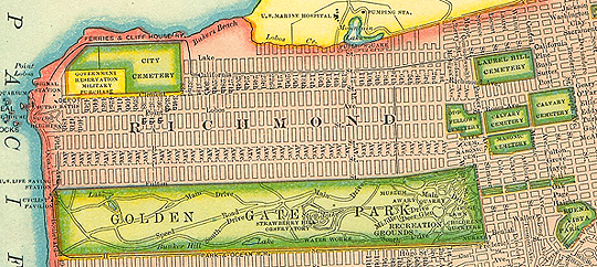
Here’s a blow-up of the cemetery locations:

1905 Map of San Francisco, Cemeteries